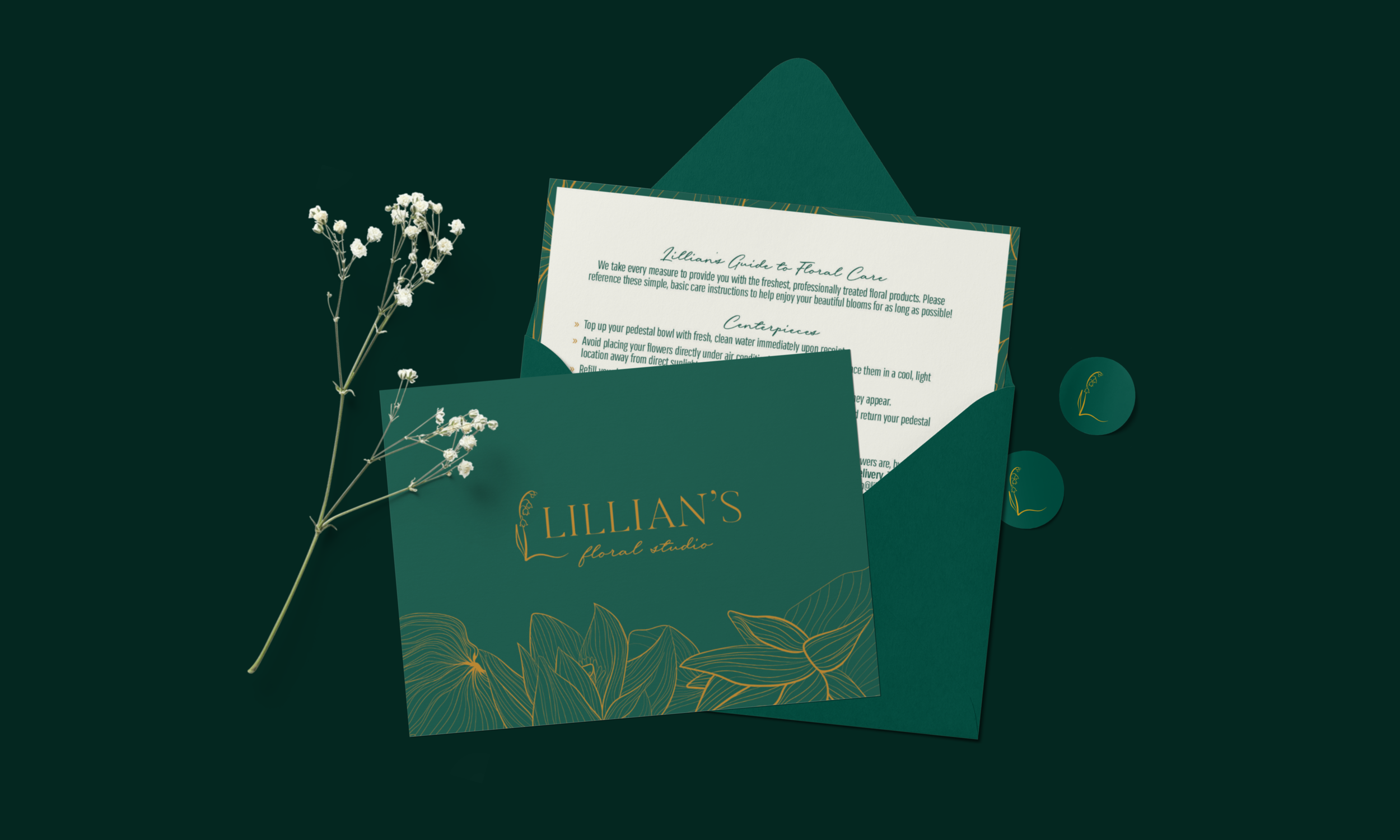
Lillian’s Floral Studio
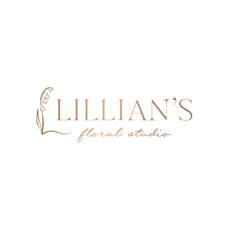
The goal of the Lillian’s Floral Studio logo was to take what was initially done for the client and develop it further, taking it to the next level. The client wanted to utilize a specific illustration of a Lily of the Valley flower as well as retain the dark jade green and implied gold foil gradient. The client wanted this logo to feel high-end and not outdated.
To refresh this logo, I used a slightly more unique, high contrast serif typeface so the logo didn’t come across as standard and unintentional. I recreated the Lily of the Valley illustration to add some dimension and varied line weight to help it feel more realistic. Because the illustration is so organic, I felt using a script typeface for “floral studio” rather than a sans serif typeface would help to tie the elements together.
Served as the lead designer and project manager on the Powell Creative team to develop the refreshed Lillian’s Floral Studio logo.
Lillian’s Floral Studio Logo Before and After